Lamps component
Lamps are a grid of status indicators that use colour and on or off state to communicate system status at a glance.
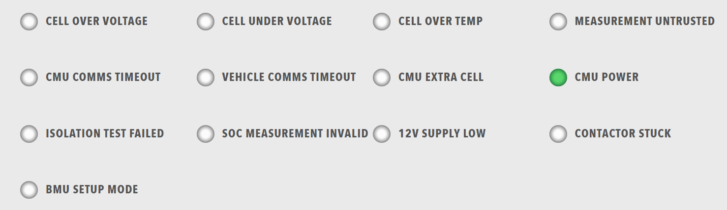
Use lamps for status indicators, error and warning displays, and a quick overview of system state. Use a single Lamp for one indicator beside other components, and Readouts when the value itself must be read.
Parameters
| Parameter | Type | Required | Default | Description |
|---|---|---|---|---|
id |
string | No | None | Not used by the web interface |
class |
string | No | None | CSS class added to the lamp-grid element |
items |
array | Yes | None | Array of lamp groups. Each group is displayed as one column |
Lamp group parameters
Each item in items must contain a lampgroup object with:
| Parameter | Type | Required | Default | Description |
|---|---|---|---|---|
id |
string | No | None | Not used by the web interface |
class |
string | No | None | Not used by the web interface |
items |
array | Yes | None | Array of lamps. The column width scales automatically with the number of lamps |
Each item in the lamp group's items must contain a lamp object.
The Lamp page describes the lamp parameters, the colour names and the display rules that a lamp follows, including why a lamp driven by an enabled binding also needs value: 1.
Example
dashboard:
  items:
    - row:
        items:
          - lamps:
              items:
                - lampgroup:
                    items:
                      - lamp:
                          color: "green"
                          label: "Online"
                          value: 1
                          enabled: true
                          bind:
                            - target: enabled
                              source: 'DBC/Status/Online'
                              toType: boolean
                      - lamp:
                          color: "red"
                          label: "Error"
                          value: 1
                          enabled: false
                          bind:
                            - target: enabled
                              source: 'DBC/Status/Error'
                              toType: boolean
                      - lamp:
                          color: "amber"
                          label: "Warning"
                          value: 1
                          enabled: false
                          bind:
                            - target: enabled
                              source: 'DBC/Status/Warning'
                              toType: boolean