Toggles
Switch components. Toggles provide on/off controls for system settings and features, allowing users to enable or disable functionality.
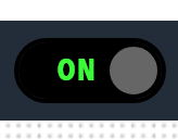
Best for: Settings controls, feature toggles, enable/disable switches, user preferences, system configuration
Parameters:
| Parameter | Type | Description |
|---|---|---|
id |
optional (string) | Unique identifier for the toggle |
class |
optional (string) | CSS class |
label |
required (string) | Toggle label |
actionId |
required (string) | Action identifier |
value |
optional (object) | Toggle state |
enabled |
optional (boolean) | Whether the toggle is enabled |
visible |
optional (boolean) | Whether the toggle is visible |
bind |
optional (array) | Data binding configuration |
Example: