Lamps
Grid of status indicators. Lamps provide visual status information using colours and states to quickly communicate system status.
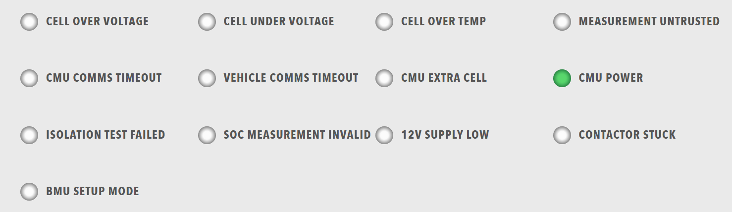
Best for: Status indicators, error/warning displays, system state visualization, quick status overview
Parameters:
| Parameter | Type | Description |
|---|---|---|
id |
optional (string) | Unique identifier for the lamps component |
class |
optional (string) | CSS class for styling |
items |
required (array) | Array of lamp groups |
Lamp Group Structure:
Each item in items must contain a lampgroup object with:
| Parameter | Type | Description |
|---|---|---|
id |
optional (string) | Unique identifier for the lamp group |
class |
optional (string) | CSS class for styling |
items |
required (array) | Array of lamps |
Each lamp item must contain a lamp object with:
| Parameter | Type | Description |
|---|---|---|
id |
optional (string) | Unique identifier for the lamp |
class |
optional (string) | CSS class for styling |
color |
required (string) | Lamp color ("green", "red", "amber", "disabled", "grey", etc.) |
label |
optional (string) | Display label |
value |
optional (number) | Lamp value (typically 0 or 1) |
enabled |
optional (boolean) | Whether the lamp is enabled |
visible |
optional (boolean) | Whether the lamp is visible |
bind |
optional (array) | Data binding configuration |
Example:
dashboard:
  items:
    - row:
        items:
          - lamps:
              items:
                - lampgroup:
                    items:
                      - lamp:
                          color: "green"
                          label: "Online"
                          value: 1
                          enabled: true
                          bind:
                            - target: enabled
                              source: '{COMPONENT_NAME}.Status.Online'
                              toType: boolean
                      - lamp:
                          color: "red"
                          label: "Error"
                          value: 1
                          enabled: false
                          bind:
                            - target: enabled
                              source: '{COMPONENT_NAME}.Status.Error'
                              toType: boolean
                      - lamp:
                          color: "amber"
                          label: "Warning"
                          value: 1
                          enabled: false
                          bind:
                            - target: enabled
                              source: '{COMPONENT_NAME}.Status.Warning'
                              toType: boolean