Tabs
Tabbed interface with header lamps and body content. Tabs organize information into separate views, allowing users to switch between different data sets or views.
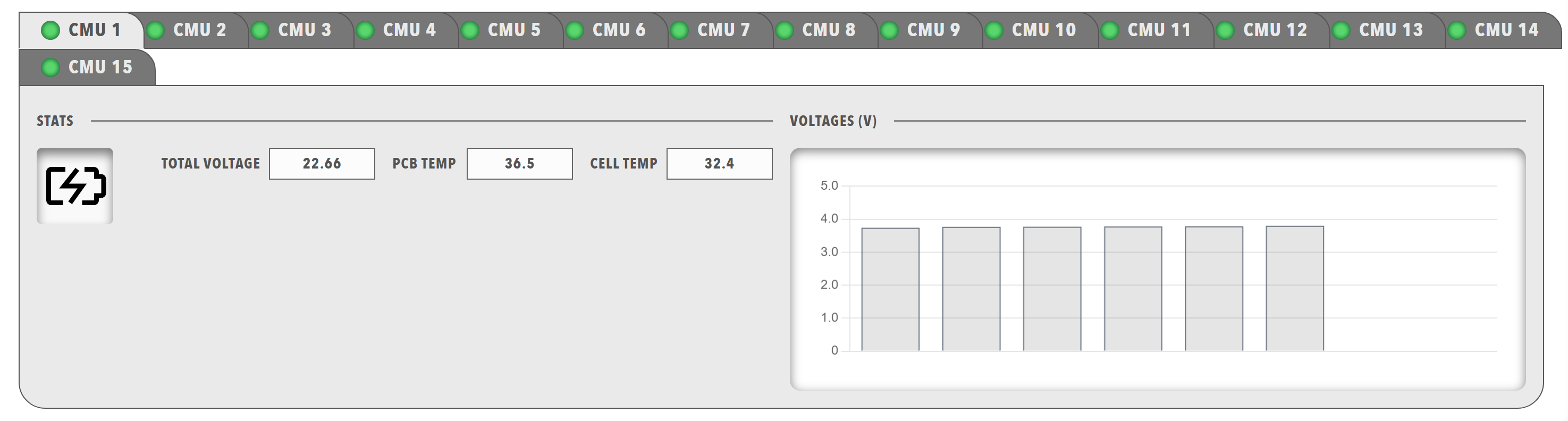
Best for: Organizing multiple data views, separating different information types, creating multi-page interfaces within a single dashboard
Parameters:
| Parameter | Type | Description |
|---|---|---|
items |
required (array) | Array of tab objects |
Tab Object Parameters:
| Parameter | Type | Description |
|---|---|---|
id |
optional (string) | Unique identifier for the tab |
class |
optional (string) | CSS class for styling |
enabled |
optional (boolean) | Whether the tab is enabled |
visible |
optional (boolean) | Whether the tab is visible |
bind |
optional (array) | Data binding configuration |
header |
required (array) | Tab header items (typically lamps) |
body |
required (array) | Tab body content (typically panels) |
Example:
dashboard:
  items:
    - row:
        items:
          - tabs:
              items:
                - tab:
                    enabled: true
                    visible: true
                    header:
                      - lamp:
                          color: disabled
                          value: 1
                          label: INFO
                    body:
                      - panels:
                          items:
                            - panel:
                                title: Low Voltage
                                items:
                                  - readouts:
                                      items:
                                        - readout:
                                            label: 15v RAIL
                                            precision: 1
                                            bind:
                                              - target: value
                                                source: '{COMPONENT_NAME}.VoltageRail15VMeasurement.Supply15V'
                                        - readout:
                                            label: 1.9v RAIL
                                            precision: 1
                                            bind:
                                              - target: value
                                                source: '{COMPONENT_NAME}.VoltageRail3V31V9Measurement.Supply1V9'