Charts
Data visualization components. Charts provide graphical representation of data trends, making it easy to understand patterns and changes over time.
Profinity supports multiple chart types to visualize data in different ways:
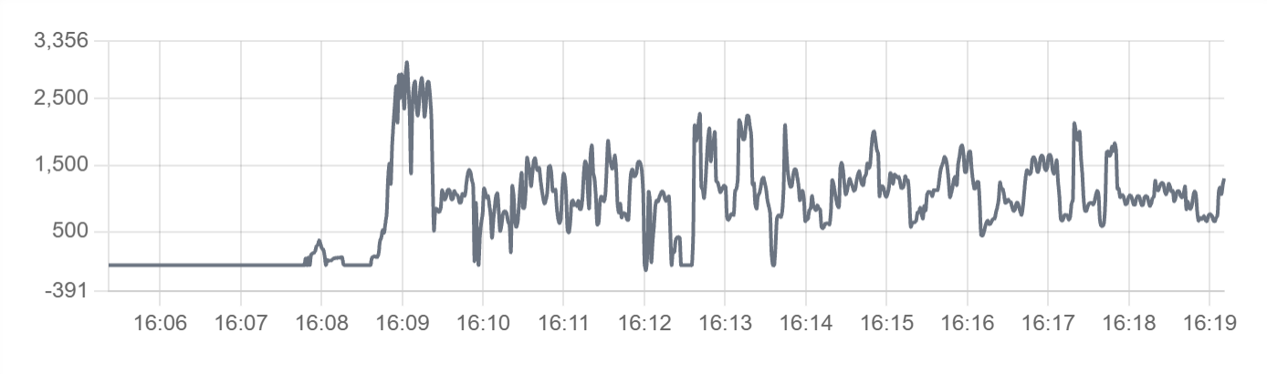
Line Chart - Ideal for showing trends and changes over time:
Bar Chart - Perfect for comparing discrete values or categories:
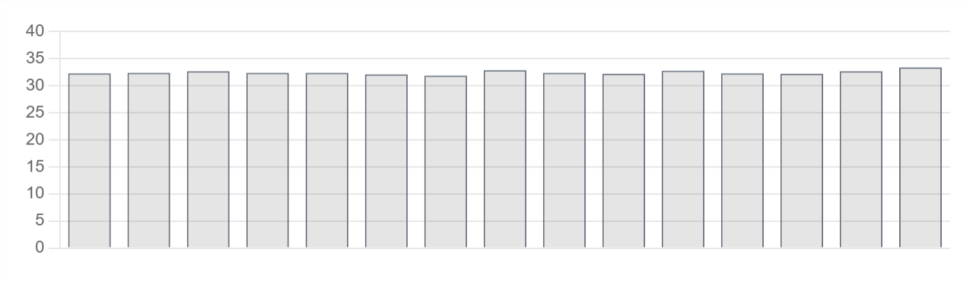
Best for: Data trends, historical analysis, performance monitoring, visual data representation, time-series data
Parameters:
| Parameter | Type | Description |
|---|---|---|
id |
optional (string) | Unique identifier for the chart |
class |
optional (string) | CSS class for styling |
type |
required (string) | Chart type - "bar", "line", "radar", "doughnut", "pie", "polarArea", "bubble", or "scatter". See Chart Types below for details |
value |
required (object/array) | Chart data (structured object with labels/datasets, or time series array) |
legend |
optional (boolean) | Show legend (default: false) |
refreshInterval |
optional (number) | Auto refresh interval in milliseconds (minimum: 0) |
showControls |
optional (boolean) | Show time range and refresh controls |
min |
optional (number) | Minimum value for chart scale (auto-calculated if not specified) |
max |
optional (number) | Maximum value for chart scale (auto-calculated if not specified) |
label |
optional (string) | Chart label |
enabled |
optional (boolean) | Whether the chart is enabled |
visible |
optional (boolean) | Whether the chart is visible |
bind |
optional (array) | Data binding configuration |
Chart Types
Profinity supports the following chart types:
line- Line charts display data points connected by lines, ideal for showing trends over timebar- Bar charts display data as rectangular bars, perfect for comparing discrete valuesradar- Radar charts display multivariate data in a two-dimensional formdoughnut- Doughnut charts display data as a circular chart with a hole in the centerpie- Pie charts display data as proportional slices of a circlepolarArea- Polar area charts display data as sectors of a circlebubble- Bubble charts display three dimensions of data (x, y, and size)scatter- Scatter charts display data points across two axes
Example with Data Binding:
dashboard:
  items:
    - row:
        items:
          - chart:
              type: bar
              legend: false
              bind:
                - target: value
                  source: Prohelion BMU.[Property].PackData.CellTempsSummaryGraph
Static Chart Example:
dashboard:
  items:
    - row:
        items:
          - chart:
              type: line
              legend: true
              value:
                labels: ["Jan", "Feb", "Mar", "Apr"]
                datasets:
                  - label: "Sales"
                    data: [65, 59, 80, 81]
                  - label: "Revenue"
                    data: [28, 48, 40, 19]
Time Series Chart Example: