Image
Interactive image component with clickable regions, icons, data values, points, and annotation lines. Images are loaded from the /Profile/Images directory.
Best for: Device diagrams, system layouts, interactive schematics, visual data overlays
When not to use: For simple static images (use HTML component with img tag), for charts (use Chart component)
Overview
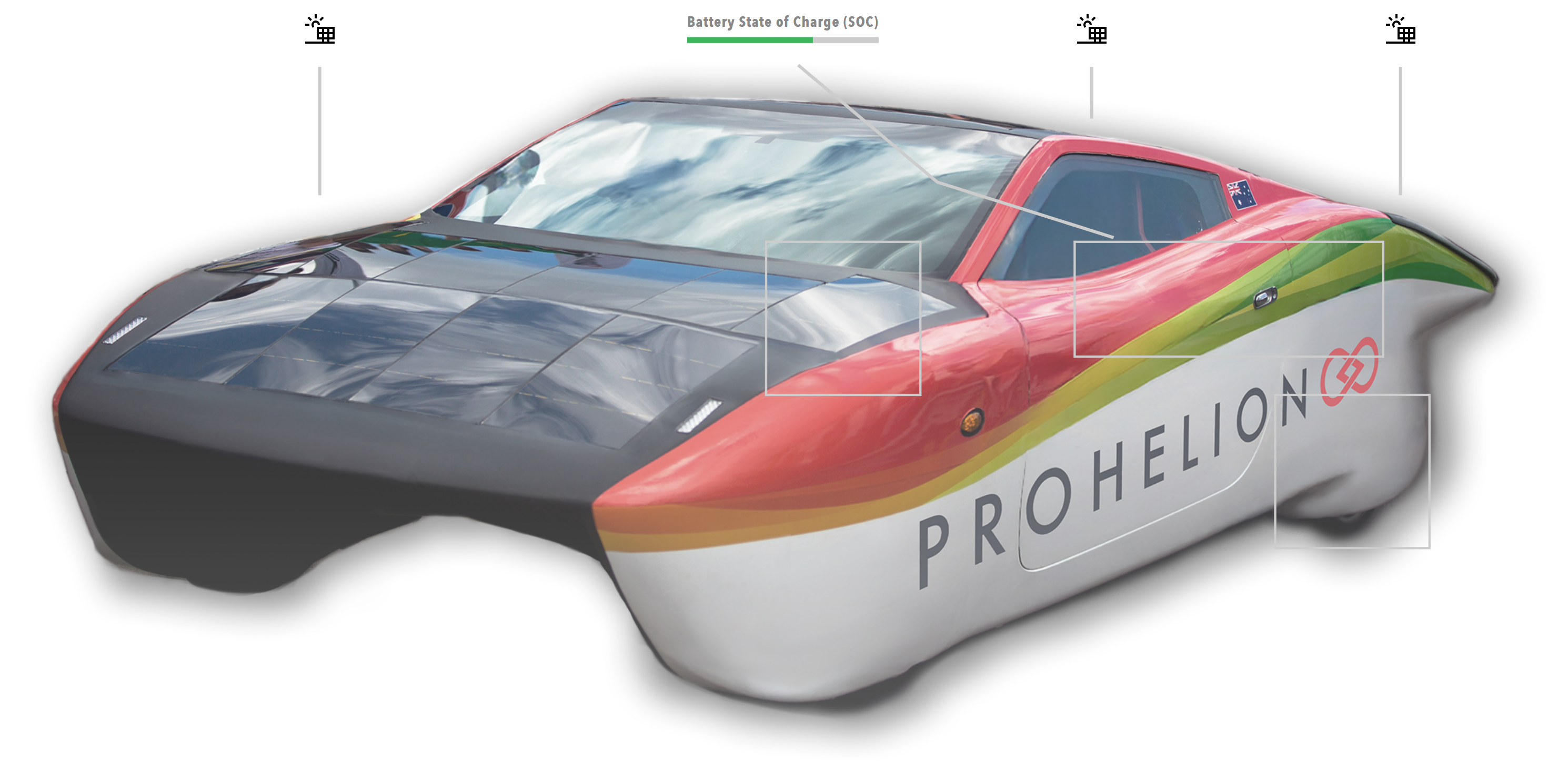
Interactive Images combine a base image with several overlay elements:
- Regions: Clickable areas on the image that can navigate to other pages or trigger actions
- Icons: Positioned icons (emoji, SVG paths, or image files) that can be interactive
- Data Values: Real-time data displays that bind to system data and update automatically
- Points: Anchor points for annotation lines
- Annotation Lines: Connecting lines between elements with optional waypoints (elbows)
All elements are positioned relative to the base image, allowing you to create complex, data-driven visualizations.
Parameters:
| Parameter | Type | Description |
|---|---|---|
id |
optional (string) | Unique identifier for the image component |
class |
optional (string) | CSS class for styling |
label |
optional (string) | Display label |
image |
required (string) | Filename of the image in /Profile/Images (no value wrapper) |
layers |
optional (array) | Named layers for visibility toggles |
regions |
optional (array) | Clickable regions |
icons |
optional (array) | Icons on the image |
dataValues |
optional (array) | Data overlays |
points |
optional (array) | Anchor points for annotation lines |
annotationLines |
optional (array) | Lines connecting elements |
bind |
optional (array) | Data binding configuration |
enabled |
optional (boolean) | Whether the image is enabled |
unit |
optional (string) | Unit for data values |
min |
optional (number) | Minimum value |
max |
optional (number) | Maximum value |
precision |
optional (number) | Decimal precision |
Base Image
The base image is the foundation of an Interactive Image component. The image file must be stored in the profile's /Profile/Images directory and referenced by filename only.
The image serves as the coordinate system for all overlay elements. Regions, icons, data values, and points are positioned relative to this base image.
Component fields (all optional except image):
| Parameter | Type | Description |
|---|---|---|
image |
required (string) | Filename of the image in /Profile/Images directory |
regions |
optional (array) | Array of clickable regions |
icons |
optional (array) | Array of icons to display on the image |
dataValues |
optional (array) | Array of data values to display |
points |
optional (array) | Array of anchor points for annotation lines |
annotationLines |
optional (array) | Array of annotation lines connecting elements |
Regions
Regions are clickable areas on the image defined by rectangular coordinates. Regions can navigate to other pages or trigger API actions.
Region Parameters
| Parameter | Type | Description |
|---|---|---|
id |
required (string) | Unique identifier for the region |
coordinates |
required (string) | Rectangle coordinates in xywh format (x, y, width, height in pixels) |
action |
required (string) | Action type - "navigate" for URLs or "action" for API actions |
target |
optional (string) | URL for navigation (when action is "navigate") |
actionId |
optional (string) | Action ID for API action (when action is "action") |
label |
optional (string) | Tooltip text displayed on hover |
visibleBorder |
optional (boolean) | Whether to show the border (default: true) |
Navigation Region Example:
regions:
  - id: "battery-region"
    coordinates: "xywh=50,100,300,200"
    action: "navigate"
    target: "/component?componentId=Battery%20Pack"
    label: "View Battery Pack"
    visibleBorder: true
Action Region Example:
regions:
  - id: "reset-region"
    coordinates: "xywh=400,300,100,50"
    action: "action"
    actionId: "reset-system"
    label: "Reset System"
    visibleBorder: true
Icons
Icons are positioned elements that can display emoji, SVG paths, or image files. Icons can be interactive and support tooltips.
Icon Parameters
| Parameter | Type | Description |
|---|---|---|
id |
required (string) | Unique identifier for the icon |
x |
required (number) | X coordinate (percentage or pixels) |
y |
required (number) | Y coordinate (percentage or pixels) |
icon |
required (string) | Icon source - emoji (e.g., "⚠️"), SVG path, or image filename from /Profile/Images |
size |
optional (number) | Icon size in pixels |
color |
optional (string) | Icon color (for SVG paths only) |
label |
optional (string) | Tooltip text displayed on hover |
action |
optional (string) | Action type - "navigate" or "action" |
target |
optional (string) | URL for navigation |
actionId |
optional (string) | Action ID for API action |
Icon Types
Emoji Icons:
Image File Icons:
icons:
  - id: "solar-icon"
    x: 25
    y: 25
    icon: "solar-panel.svg"
    size: 64
    label: "Solar Panel"
    action: "navigate"
    target: "/component?componentId=Solar%20Panel"
SVG Path Icons:
icons:
  - id: "custom-icon"
    x: 75
    y: 75
    icon: "M 10 10 L 90 90 M 90 10 L 10 90"
    size: 40
    color: "#FF0000"
    label: "Custom Icon"
Data Values
Data Values display real-time data from the Profinity system. They support multiple display types (text, graph/bar chart, status/lamp) and can bind to any data source.
Data Value Parameters
| Parameter | Type | Description |
|---|---|---|
id |
required (string) | Unique identifier for the data value |
x |
required (number) | X coordinate for data display position (percentage or pixels) |
y |
required (number) | Y coordinate for data display position (percentage or pixels) |
label |
optional (string) | Label to display (falls back to id if not provided) |
bind |
required (string/array) | Data binding configuration |
displayType |
optional (string) | How to display - "text" (default), "graph" (bar chart), or "status" (lamp) |
maxValue |
optional (number) | Maximum value for bar chart (required if displayType is "graph") |
lampColor |
optional (string) | Lamp color when displayType is "status" (default: "grey") |
unit |
optional (string) | Unit for the value |
precision |
optional (number) | Number of decimal places |
enabled |
optional (boolean) | Whether the data value is enabled |
min |
optional (number) | Minimum value |
max |
optional (number) | Maximum value |
value |
optional (string/number) | Mock value (ignored when using real bindings) |
Display Types
Text Display:
dataValues:
  - id: "temperature"
    x: 30
    y: 40
    label: "Temperature"
    bind:
      - target: value
        source: '{COMPONENT_NAME}.Temperature.Value'
    displayType: "text"
    unit: "°C"
    precision: 1
Graph Display (Bar Chart):
dataValues:
  - id: "battery-soc"
    x: 70
    y: 40
    label: "SOC"
    bind:
      - target: value
        source: '{COMPONENT_NAME}.StateOfCharge.SOCPercent'
    displayType: "graph"
    maxValue: 100
    unit: "%"
    precision: 1
Status Display (Lamp):
dataValues:
  - id: "system-status"
    x: 50
    y: 60
    label: "Status"
    bind:
      - target: value
        source: '{COMPONENT_NAME}.Status.Online'
        toType: boolean
    displayType: "status"
    lampColor: "green"
Points
Points are anchor points for annotation lines. They can be displayed as visual markers or used as connection points for annotation lines.
Point Parameters
| Parameter | Type | Description |
|---|---|---|
id |
required (string) | Unique identifier for the point |
x |
required (number) | X coordinate (percentage or pixels) |
y |
required (number) | Y coordinate (percentage or pixels) |
size |
optional (number) | Point size in pixels (if > 0, the point will be displayed) |
color |
optional (string) | Point color (defaults to grey) |
Visible Point Example:
Invisible Anchor Point Example:
Annotation Lines
Annotation Lines connect elements (icons, data values, regions, or points) with optional waypoints (elbows) for routing. Lines are drawn automatically between connected elements.
Annotation Line Parameters
| Parameter | Type | Description |
|---|---|---|
id |
required (string) | Unique identifier for the annotation line |
fromId |
required (string) | ID of element to connect from (icon, dataValue, region, or point) |
toId |
required (string) | ID of element to connect to (icon, dataValue, region, or point) |
elbows |
optional (array) | Array of elbow points for bent lines (relative to image, 0-100%) |
Direct Line Example:
Line with Waypoints Example:
annotationLines:
  - id: "routed-connection"
    fromId: "sensor-icon"
    toId: "sensor-data"
    elbows:
      - x: 50
        y: 30
      - x: 70
        y: 50
Coordinate Systems
Interactive Images support two coordinate systems:
- Percentage: Coordinates relative to image size (0-100%)
- Pixels: Absolute pixel coordinates
Percentage Coordinates:
Pixel Coordinates:
regions:
  - id: "pixel-region"
    coordinates: "xywh=100,50,200,150"  # x, y, width, height in pixels
    action: "navigate"
    target: "/component?componentId=Battery"
Regions always use pixel coordinates in the xywh format. Icons, data values, and points can use either percentage or pixel coordinates.
Image Storage
Interactive Image files must be stored in the profile's /Profile/Images directory. Images are referenced by filename only (not full paths).
/Profile/Images/
  ├── device-diagram.png
  ├── battery-system.png
  ├── solar-panel.svg
  └── custom-icon.png
Images are served from /Profile/Images/{filename} URL path, so you can reference them in your dashboard YAML:
Tooltips and Hover Behavior
- Regions: Display tooltips on hover (if
labelis provided) - Icons: Display tooltips on hover (if
labelis provided) - Data Values: No tooltips (they display data directly)
Tooltips are positioned above the element and follow the mouse cursor.
Complete Example
Here's a complete example combining all Interactive Image features:
dashboard:
  items:
    - row:
        items:
          - image:
              image: "battery-system.png"
              regions:
                  - id: "battery-region"
                    coordinates: "xywh=100,100,200,150"
                    action: "navigate"
                    target: "/component?componentId=Battery%20Pack"
                    label: "Battery Pack"
                    visibleBorder: true
                  - id: "charger-region"
                    coordinates: "xywh=350,100,150,100"
                    action: "navigate"
                    target: "/component?componentId=Charger"
                    label: "Charger"
              icons:
                  - id: "status-icon"
                    x: 50
                    y: 30
                    icon: "🔋"
                    size: 48
                    label: "Battery Status"
                    action: "navigate"
                    target: "/component?componentId=Battery%20Pack"
                  - id: "warning-icon"
                    x: 75
                    y: 25
                    icon: "⚠️"
                    size: 32
                    label: "Warning"
              dataValues:
                  - id: "voltage"
                    x: 50
                    y: 60
                    label: "Voltage"
                    bind:
                      - target: value
                        source: '{COMPONENT_NAME}.Voltage.Value'
                    displayType: "text"
                    unit: "V"
                    precision: 2
                  - id: "soc"
                    x: 70
                    y: 60
                    label: "SOC"
                    bind:
                      - target: value
                        source: '{COMPONENT_NAME}.StateOfCharge.SOCPercent'
                    displayType: "graph"
                    maxValue: 100
                    unit: "%"
                    precision: 1
                  - id: "status"
                    x: 50
                    y: 50
                    label: "Status"
                    bind:
                      - target: value
                        source: '{COMPONENT_NAME}.Status.Online'
                        toType: boolean
                    displayType: "status"
                    lampColor: "green"
              points:
                  - id: "anchor-1"
                    x: 25
                    y: 25
                    size: 5
                    color: "#FF0000"
              annotationLines:
                  - id: "status-line"
                    fromId: "status-icon"
                    toId: "status"
                    elbows:
                      - x: 50
                        y: 40
                  - id: "data-line"
                    fromId: "anchor-1"
                    toId: "voltage"
Best Practices
- Use appropriate coordinate systems: Use percentage coordinates for elements that should scale with the image, pixel coordinates for fixed-size elements
- Keep IDs unique: All element IDs (regions, icons, data values, points) must be unique within an Interactive Image
- Use descriptive labels: Provide labels for regions and icons to improve usability
- Optimize image size: Use appropriately sized images to balance quality and performance
- Test interactivity: Verify that regions and icons navigate correctly and actions work as expected
- Use data bindings: Bind data values to live system data for real-time updates